TIME and Space | By Jeffrey Kluger
Editors note:On Nov. 29, 2016, Google released a major update expanding the data from 2012 to 2016. Read about the update here.
Spacecraft and telescopes are not built by people interested in what’s going on at home. Rockets fly in one direction: up. Telescopes point in one direction: out. Of all the cosmic bodies studied in the long history of astronomy and space travel, the one that got the least attention was the one that ought to matter most to us—Earth.
That changed when NASA created the Landsat program, a series of satellites that would perpetually orbit our planet, looking not out but down. Surveillance spacecraft had done that before, of course, but they paid attention only to military or tactical sites. Landsat was a notable exception, built not for spycraft but for public monitoring of how the human species was altering the surface of the planet. Two generations, eight satellites and millions of pictures later, the space agency, along with the U.S. Geological Survey (USGS), has accumulated a stunning catalog of images that, when riffled through and stitched together, create a high-definition slide show of our rapidly changing Earth. TIME is proud to host the public unveiling of these images from orbit, which for the first time date all the way back to 1984.
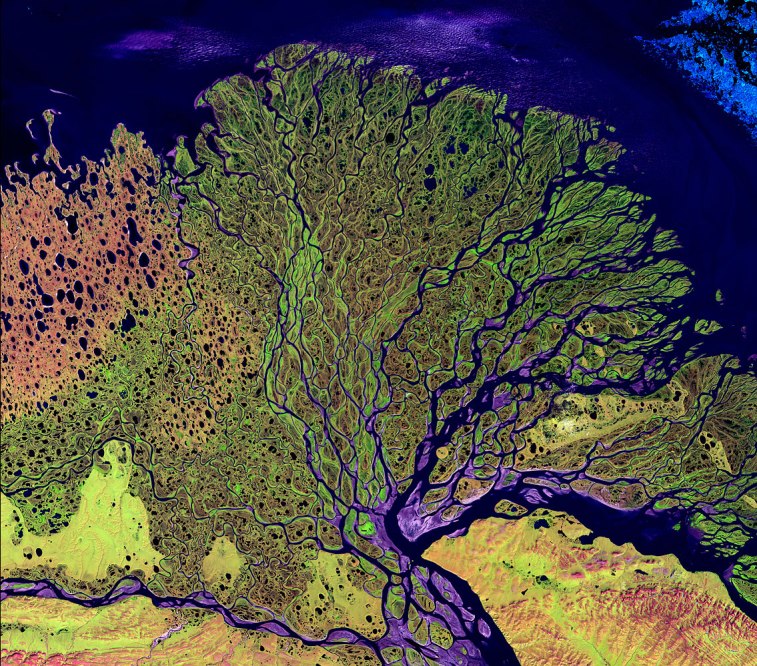
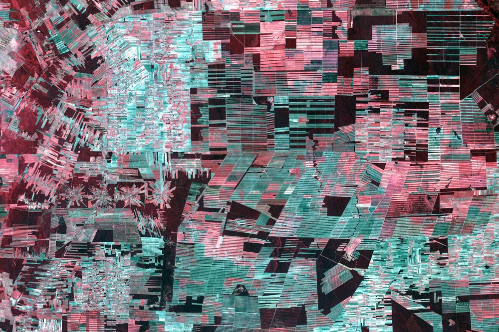
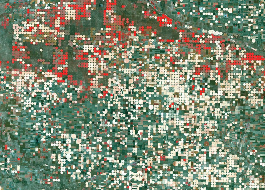
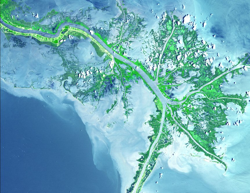
Over here is Dubai, growing from sparse desert metropolis to modern, sprawling megalopolis. Over there are the central-pivot irrigation systems turning the sands of Saudi Arabia into an agricultural breadbasket — a surreal green-on-brown polka-dot pattern in the desert. Elsewhere is the bad news: the high-speed retreat of Mendenhall Glacier in Alaska; the West Virginia Mountains decapitated by the mining industry; the denuded forests of the Amazon, cut to stubble by loggers.
It took the folks at Google to upgrade these choppy visual sequences from crude flip-book quality to true video footage. With the help of massive amounts of computer muscle, they have scrubbed away cloud cover, filled in missing pixels, digitally stitched puzzle-piece pictures together, until the growing, thriving, sometimes dying planet is revealed in all its dynamic churn. The images are striking not just because of their vast sweep of geography and time but also because of their staggering detail. Consider: a standard TV image uses about one-third of a million pixels per frame, while a high-definition image uses 2 million. The Landsat images, by contrast, weigh in at 1.8 trillion pixels per frame, the equivalent of 900,000 high-def TVs assembled into a single mosaic.
These Timelapse pictures tell the pretty and not-so-pretty story of a finite planet and how its residents are treating it — razing even as we build, destroying even as we preserve. It takes a certain amount of courage to look at the videos, but once you start, it’s impossible to look away.
Chapter 1: Satellite Story | By Jeffrey Kluger
It’s a safe bet that few people who have grown up in the Google era have ever heard of Stewart Udall. A U.S. Representative of Arizona’s 2nd Congressional District from 1955 to 1961, Udall left the House to become Interior Secretary under Presidents Kennedy and Johnson. That was pretty much it for his time in the public eye — not exactly an icon of the wired generation, right?
But in 1966, Udall and his staff had an idea. For all the attention the then budding space program was devoting to other planets, our own was being overlooked. If humanity wanted to protect its threatened natural resources, we first had to be able to keep an eye on them. That meant a satellite or, preferably, multiple satellites that could maintain a steady downward gaze, tracking habitat destruction, urbanization, industrial sprawl and more. Udall’s concern gave rise to Project EROS (Earth Resources Observation Satellites), later renamed Landsat. For all the bad and misguided ideas that came out of the 1960s, this scheme turned out to be very, very good.
Since NASA launched the first Landsat satellite in 1972, the program has been in constant operation. Seven other satellites followed the first into orbit over the years, sometimes replacing ones that had reached the end of their operational life, sometimes joining ones still in operation. The most recent member of the fleet, Landsat 8, went aloft in February. At an altitude of 438 miles (705 km), the satellites make one orbit of Earth every 84.3 minutes. Keep that up for 41 years, maintaining a photographic record of your travels, and you compile a whole lot of pictures — millions of them, which have since been digitized into petabytes, or billions of bytes of data.
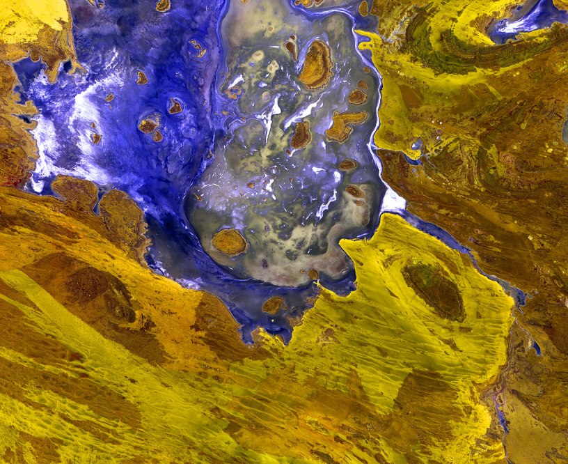
The Earth as Art: Satellite Images of Our Planet from Orbit

In 2008 the U.S. government ruled that those pictures, which had been available for sale to the public, should be free. That caught the attention of the folks at Google. While Google Maps and Google Earth were wildly popular with Web users, scientists found the satellite images limiting. They captured only part of the visible spectrum, and what’s more, they were static. A picture of, say, a reservoir or a section of forest could tell you a lot about those sites, but only how they looked at one moment on one day. Landsat’s cameras, on the other hand, revisit the same part of the planet on average once every 16 days. Collect enough of those pictures and sequence them, and you can create a moving image that shows just how a region has changed environmentally — often for the worse — over the years.
In 2009 Google met with Tom Loveland, a lead scientist with the USGS — which is home to the Landsat archives — about turning the trove of images into maps and mini-movies for the use of governments and researchers around the world. Google and the USGS soon struck a deal, but that was the easy part.
First, even though the USGS had millions of images in its vaults, there were still more to be had, most of them tucked away in active and former Landsat ground stations around the world. Google began reaching out to the countries that are home to those facilities, working to repatriate as many of the images as it could. In one six-month period, it collected half a million pictures, most of them stored in traditional negatives and prints, and began digitizing them. Even getting the already digitized EROS and Landsat images from the USGS to Google took some doing, necessitating the construction of a new digital pipeline that could handle the massive stream of data.
Processing the images required another magnitude of complexity. The atmosphere does not always cooperate when a satellite tries to take a picture from orbit. Everything from cloud cover and industrial haze to smoke from forest fires can obscure the view. Stitching together a panorama, to say nothing of making a moving image, often requires hundreds of images, some of which must be digitally scrubbed to filter out atmospheric interference. A single, cloud-free map of the world requires 9,000 discrete images.
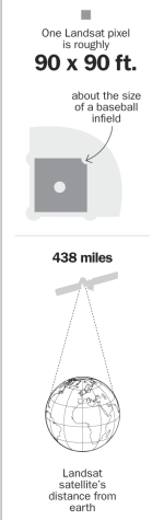
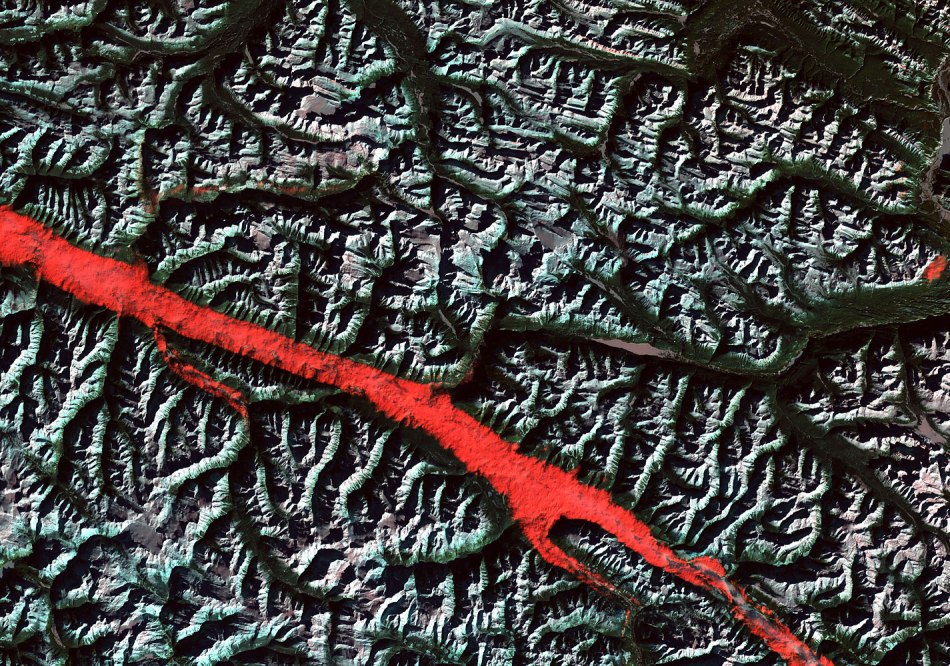
The pictures, and particularly the movies, that resulted from this painstaking work are astounding. A single pixel measures about 33 yards (30 m) square, or roughly the size of a baseball infield. That seems like a lot of ground to pack into a single dot, and the truth is, no one pixel reveals very much. But tens of thousands of them tell rich tales: the decapitation of mountaintops by mining companies extracting the mineral riches beneath; the fish-bone-like patterns loggers carve into forests as they fell trees in intersecting avenues, until the entire region is denuded; lakes and reservoirs that shrink in inverse proportion to the thirsty cities and communities growing up around them; the retreat and disappearance of glaciers.
There is some good news: central-pivot irrigation systems can be seen turning deserts into gardens, forming their own pixelated patterns as little circles of green appear, accumulate and expand. There are also the oil sands fields of Canada that pop up from nowhere and aren’t pretty to look at but are helping to free the U.S. and other countries from dependence on petro-dictators.
Already, the public-private collaboration is paying environmental dividends. Anxious to get a handle on the health of its forests, the government of Mexico contacted Google about putting together a comprehensive map that could reveal how much ground cover is still intact and how much has been lost. Google and Landsat delivered, creating a visual survey made up of 53,000 images, representing 18 terabytes of data that required 15,000 hours of computer time to complete. The process was actually quite quick: Google put a thousand computers to work simultaneously, so the job was completed in a single, rather long workday. A solitary computer would have needed three years.
For governments and environmental scientists, there is a lot of arcane data to extract from the maps and movies. For everyone else, there is something subtler but just as important: perspective. We tend our own tiny plots on Earth, our houses and yards often taking up less room than that infield-size pixel. It’s only when we get above ourselves — say, 438 miles above — that we can see how we’re changing our planet and begin to consider how we can be better stewards of it.
Chapter 2: Extreme Resources | By Bryan Walsh
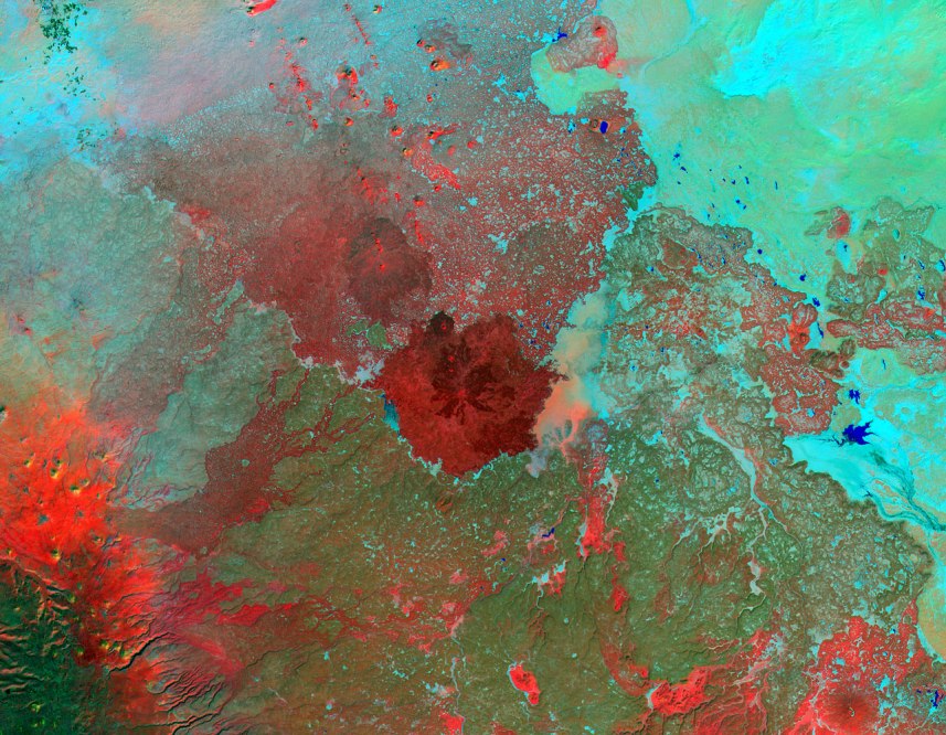
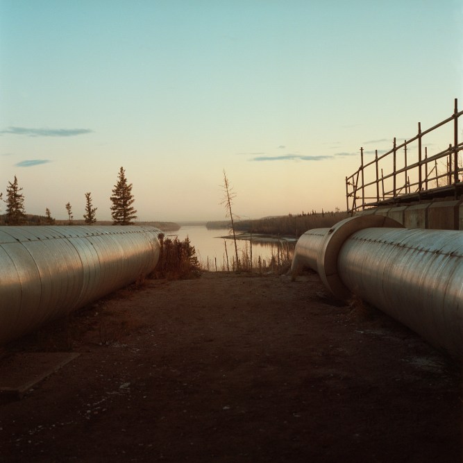
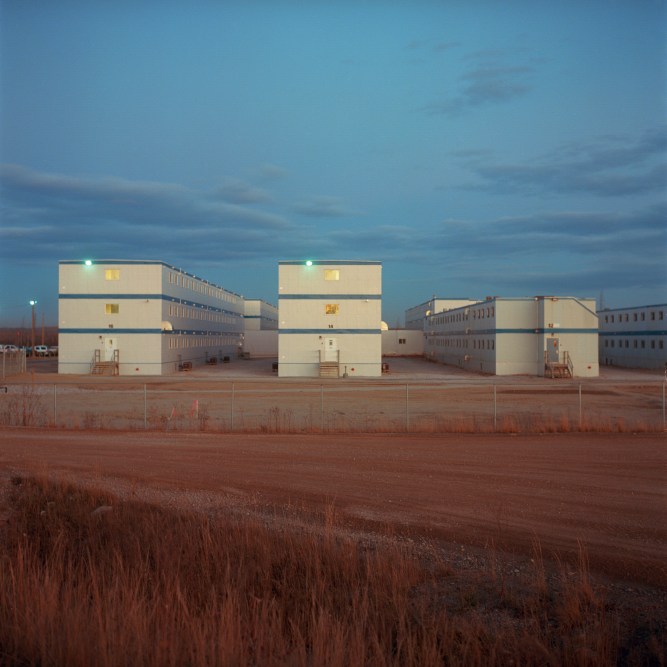
You can’t understand the sheer scale of the oil-sands development in northeastern Alberta unless you’ve been there — preferably flying over the vast spread of open mines, roads and broken forests in a helicopter. Starting near the booming frontier town of Fort McMurray, you can see vast chunks of land that have been carved out of the endless arboreal forest, where massive machines dig out the rich, black sand that just might transform the global oil market—unless environmentalists stop it. Oil-sands development isn’t just changing Alberta, where oil companies have stripped away forests to dig open mines and tailing ponds filled with waste are visible from the sky. The oil sands represent a new kind of extreme energy resource that promises to make fossil fuels available far into the future but at a heavy environmental price.
What’s truly amazing — and perhaps alarming — about this new era of extreme resources is how fast they’re developing. My visit to the Albertan oil sands came late in 2010. In the two and a half years since, oil companies there have produced nearly a billion new barrels of crude. As time-lapse satellite images show, much of this development is relatively new, a response to the sharp increase in the price of oil over the past decade. Similar trends are also at work in the vast coalfields of the Powder River Basin in Wyoming, the mountaintop mines of West Virginia and the rain forests of the Brazilian state of Rondonia. A growing global population and a ravenous demand for natural resources is altering the very face of the planet. Thanks to the Timelapse imagery, we can see it happening.
The oil sands near the Athabasca river in Alberta aren’t a recent discovery. They first came to the attention of European settlers in the early 18th century, and native Canadians in the region had been using the sticky, bituminous sands for centuries — not to burn for energy but to caulk their canoes. True to the name “oil sands,” the crude found near the Athabasca is bound in the sand itself, and it wasn’t until the mid-20th century that researchers developed a way to process the oil. Unlike conventional crude found in places like Saudi Arabia and Texas, oil-sands crude can’t simply be pumped out of the ground; companies have to dig it out and then heat it, separating the oil from the sand. There’s a lot there — as many as 200 billion barrels are economically recoverable at today’s oil price. And that price matters. All that additional effort and energy means that it costs more to produce a barrel of oil sands crude than traditional oil. It also means a barrel produces about 15% more greenhouses gases, on average, than a barrel of conventional crude.
Given the extra cost and effort, commercial oil-sands production began only in 1967, with investment slowing or stopping when the global price of oil plummeted in the 1980s and much of the ’90s. Even that early production took a toll on the land. Companies mined oil sands in open pits that left scars on the earth, and processing the resulting ore left a lot of tailings and wastewater, which were discharged into ponds. Up close you can smell the tarry stench from the processing upgraders. It’s not for nothing that the oil-sands region has been compared to Mordor, and First Nations Canadians who live downriver from the oil-sands developments worry about water contamination and even cancer.
Life Near the World’s Largest Oil Extraction Project
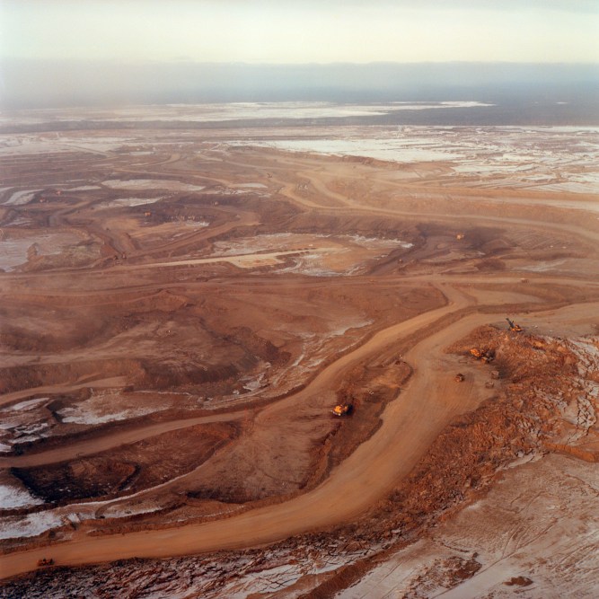


Still, as the satellite images show, as long as the demand for oil is strong — it grew to 88 million barrels a day last year — the oil-sands development in Alberta will keep increasing. The footprint may shrink somewhat thanks to a new mining process called in-situ extraction, which involves cooking and processing the sands underground, without open-pit mining. But that method requires more energy, which can mean more greenhouse gases. Full-throttle development of the oil sands might not be “game over” in the fight against climate change, as the global-warming researcher and activist James Hansen put it a couple of years ago; the oil sands represent just a fraction of the fossil fuels left to be burned. But it certainly wouldn’t help us get off carbon any faster.
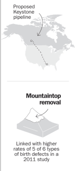
And that’s why something that you can’t yet see in the Timelapse images of the oil sands is still very important to their future — and perhaps the climate’s as well. The proposed Keystone XL pipeline would carry nearly a million barrels of oil-sands crude a day across the border into the U.S. The pipeline has yet to be approved by President Obama, and environmentalists have identified Keystone as a red line, calling on the White House to cancel the project over climate concerns. At the same time, conservatives are pushing Obama to approve it on the grounds that the U.S. will be able to use Canadian oil to displace imported crude from the politically antagonistic Middle East and Russia. How the Athabasca oil sands will look in 30 years may depend on Obama’s decision.
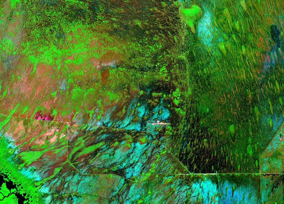
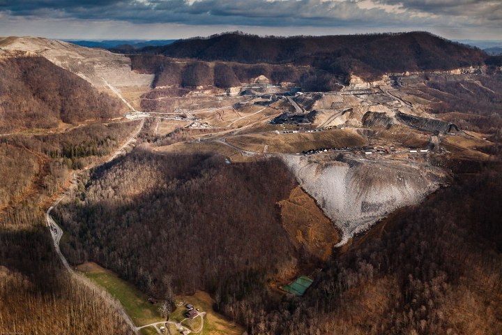
The name says it all: In mountaintop-removal mining (MTR), the summit ridges of hills and mountains — known in mining parlance as the “overburden” — are removed, allowing miners to get at the seams of coal underneath. The process is effective and cheap, requiring fewer workers than conventional mining. That’s why, as satellite photos show, miners have decapitated mountains throughout the Appalachian area in West Virginia and Kentucky, one range after another.
But if MTR has helped keep the faltering Appalachian coal-mining industry alive, it can also exact a terrible toll on the environment and human health. Removed overburden needs to be put somewhere, and as a result, soil contaminated by toxic mining by-products ends up in valley fills, poisoning local streams. The mountaintop-removal process destroys deciduous forests, and while companies work to reclaim the land after mining is finished, some environmental disruption will always remain.
The communities that live near mining sites can be endangered by contaminated water or toxic dust in the air. A 2011 study found that counties in and near mountaintop mining areas had higher rates of many birth defects, as well as higher rates of cancer. The dramatic effects of mountaintop removal mining can be seen from space. But the real dangers might be invisible.
While the popular image of coal miners is still sooty-faced West Virginians, the real center of coal mining in the U.S. is shifting away from Appalachia. Instead it’s found in the Powder River Basin (PRB), which covers some of Wyoming and Montana and which now produces nearly half of America’s coal. As the Timelapse images show, full-scale production in the PRB is relatively recent. That’s because PRB coal contains on average about a third less sulfur than Appalachian coal, which means that plants that burn PRB coal release less sulfur dioxide (SO2) into the air. The cleaner PRB coal wasn’t worth the extra effort of mining it until the government enacted tougher air-pollution standards that mandate a reduction in SO2, a major cause of acid rain. Switching to low-sulfur PRB coal was a cheap way for plants to meet air-pollution standards, prompting increased coal mining in Wyoming and Montana.
But that may change in the future. Thanks to increasing concern over climate change and competition from cheaper and cleaner natural gas, coal use is on the wane in the U.S. If we ever get truly serious about climate change, we’ll need to completely cut out coal, the single biggest contributor to global warming. So the U.S. coal industry is increasingly looking to the export market. Last year American coal exports hit a record 126 million tons. The biggest potential market for coal exports is China, which consumed nearly 3.9 billion metric tons last year, and the PRB region is well situated to ship across the Pacific. Or at least it would be, if there were any coal export terminals on the West Coast. Coal companies are trying to build several terminals in Oregon and Washington State, while environmentalists are trying to stop them. The PRB region’s fate will depend on who wins that battle.
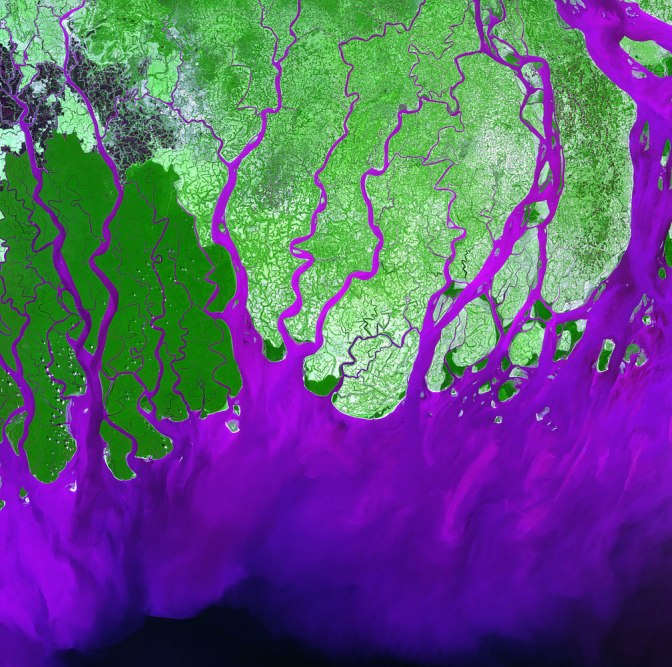
The state of Rondonia in western Brazil is in the heart of the Amazon and was once home to nearly 50 million acres of pristine rain forest. No longer, though. Today Rondonia represents one of the most heavily deforested areas in the Amazon. The loss of forest has been rapid—nearly 25,000 sq. mi. (65,000 sq. km) of forest disappeared from 1978 to 2003. That’s an area roughly the size of West Virginia.
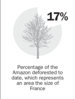
How do humans clear that much forest? Satellite images show that deforestation occurs in a fishbone pattern. Usually a road first extends deep into the forest. Some trees fall to make way for the road, but the real impact is caused by an influx of settlers and loggers. They clear more forest to make room for farmland, but the heavy rains soon erode the soil, which then forces settlers to clear even more forest. People then convert the leftover land into pasture for growing herds of cattle. And so the rain forest dies.
The good news is that in recent years the Brazilian government has reduced the rate of deforestation, in part with the help of advanced satellite imagery that can track forest loss nearly in real time. But the past few years may represent only a brief break in the long-term loss of the Amazon: a recent study found that deforestation was up significantly in 2012.
Chapter 3: Climate Change | By Jeffrey Kluger
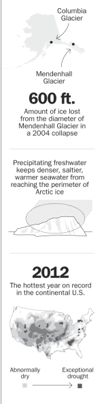
For a long time now, Earth has been running a fever. Never mind the few remaining climate-change deniers — really, never mind them; the world has at last moved on — it’s getting awfully toasty down here. The numbers tell the story: 2012 was the hottest year on record in the continental U.S., the 15th driest and the second most volatile, with 11 natural weather disasters, including Superstorm Sandy. Of the 10 hottest years on record worldwide, nine have occurred in the 21st century; the exception was 1998. Average temperatures around the world are up 1.4ºF (0.8ºC) since 1880. On a planet whose water-based chemistry tips one way or the other on tiny thermal fulcrums, that’s a lot.
More important than those statistics are our everyday experiences — the droughts and wildfires searing the American West, the succession of 90-degree days in U.S. cities that once enjoyed less-punishing summers, the steadily rising sea levels inundating coasts and swallowing islands. The planet is sweating, and we feel it every day.
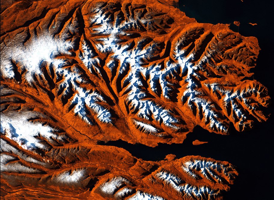
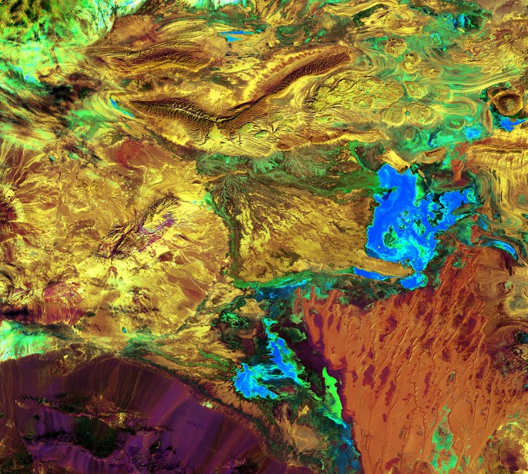
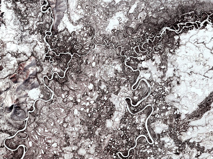
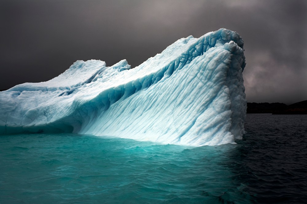
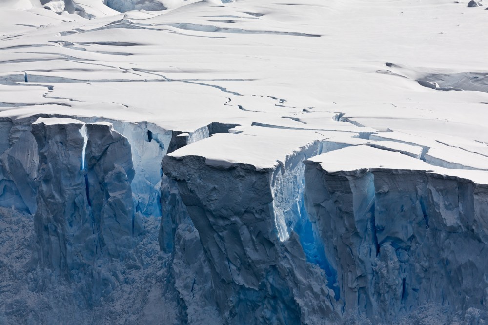
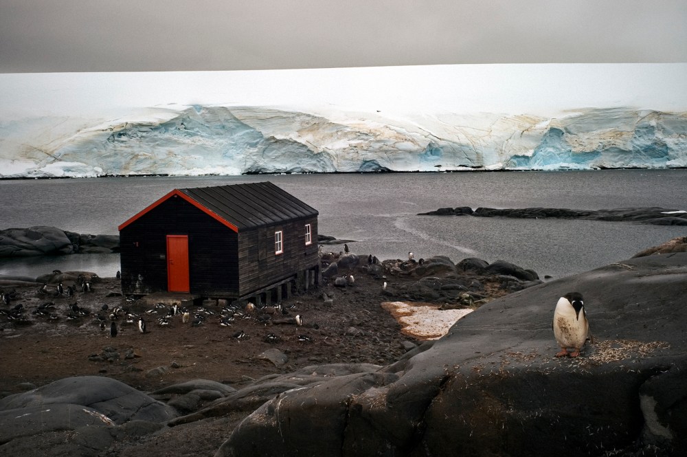
Nowhere is the fluctuation in the earthly thermostat more visible than in the Arctic, as the above Timelapse video of diminishing glaciers demonstrates. In just the past decade, the average size of the summer polar ice cap has been slashed nearly in half, from 2.7 million sq. mi. (7 million sq. km) to just 1.4 million sq. mi. (3.6 million sq. km). In some areas, a clear, navigable passage has opened up during the warmest months, and while that may seem good for global trade — and it is — it’s very bad for the health of the planet. The ice that melts off the Greenland landmass is a key contributor to rising sea levels. What’s more, the ice loss is accelerating, and it will continue to do so for quite some time even if global temperatures stopped rising today. That’s because bright white ice reflects sunlight back into space, while dark blue water absorbs it. Every acre of sea that opens up therefore becomes something of a heat sink, raising the water temperature higher and higher, causing the remaining ice to melt even faster.
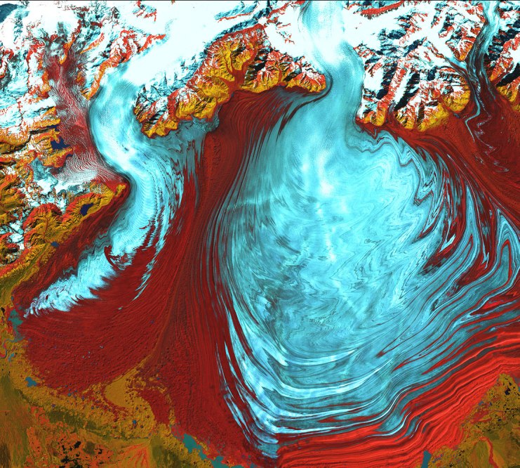
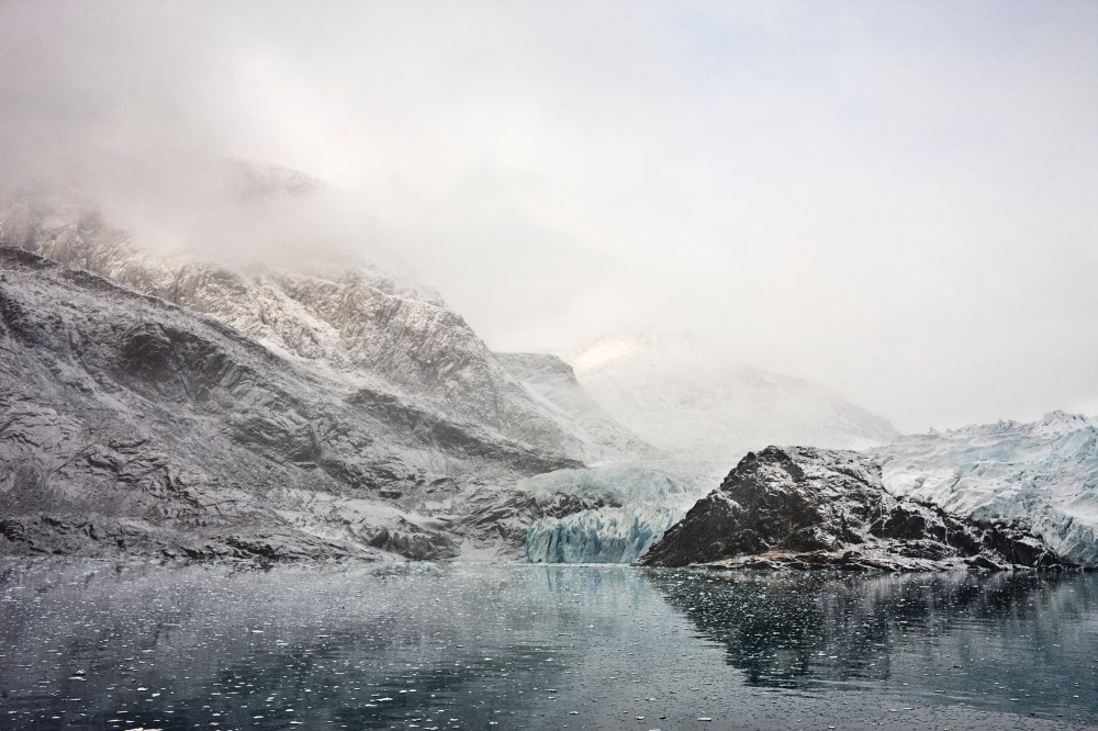
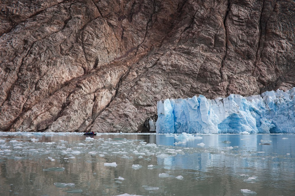
For the U.S., this is very much a close-to-home problem, since some of the most dramatic glacier loss is occurring in Alaska — a fact the new Landsat imagery shows in crisp detail. (See above.) Columbia Glacier, in Prince William Sound, once spilled from 10,000 ft. (3,050 m) above sea level in the Chugach Mountains, down though an inlet and out into the water past Heather Island. It barely moved an inch from that position from the time it was discovered in 1794 until 1980.
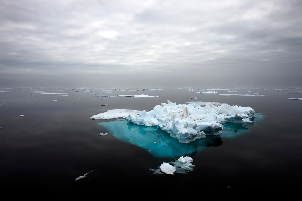
Since then, as the video reveals, it has not so much retreated as practically fled. At one point in 2001, it pulled back at an estimated speed of 98 ft. (30 m) per day. It has now lost about 12 mi. (20 km) in length and nearly 1,300 ft. (400 m) in thickness. The forlorn reminders of the glacier’s former footprint remain, just beyond Heather Island, in the form of icebergs that calved away as the main mass crumbled, later clustering together in what environmental scientists have nicknamed an “ice mélange.” But the dark, warming waters should ensure that the mélange melts too, and the only reminder of Columbia’s original size will be found in the photo archive.
Mendenhall Glacier, not far from Juneau, has been similarly dying — and its decline has also been captured by Landsat. Smaller than Columbia — at its maximum size, it was just 14 mi. (22 km) long — it has lost at least 1.75 mi. (2.8 km) so far. The summer of 2004 was an especially bad time for Mendenhall, when a dramatic collapse of its leading edge caused it to lose about 600 ft. (200 m) of ice at once.
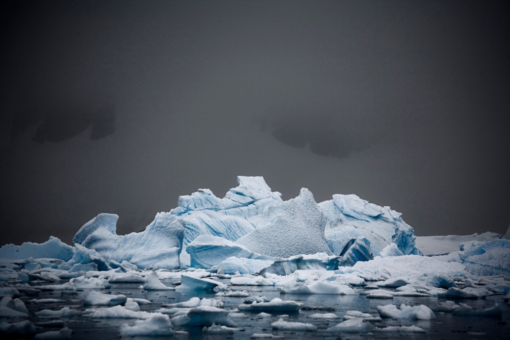
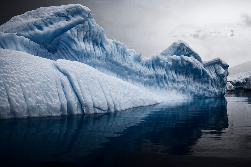
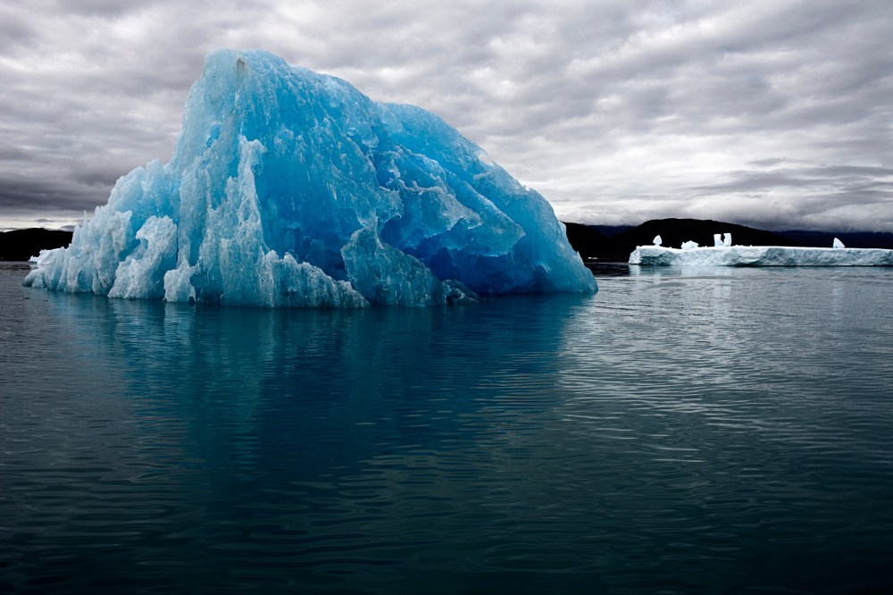
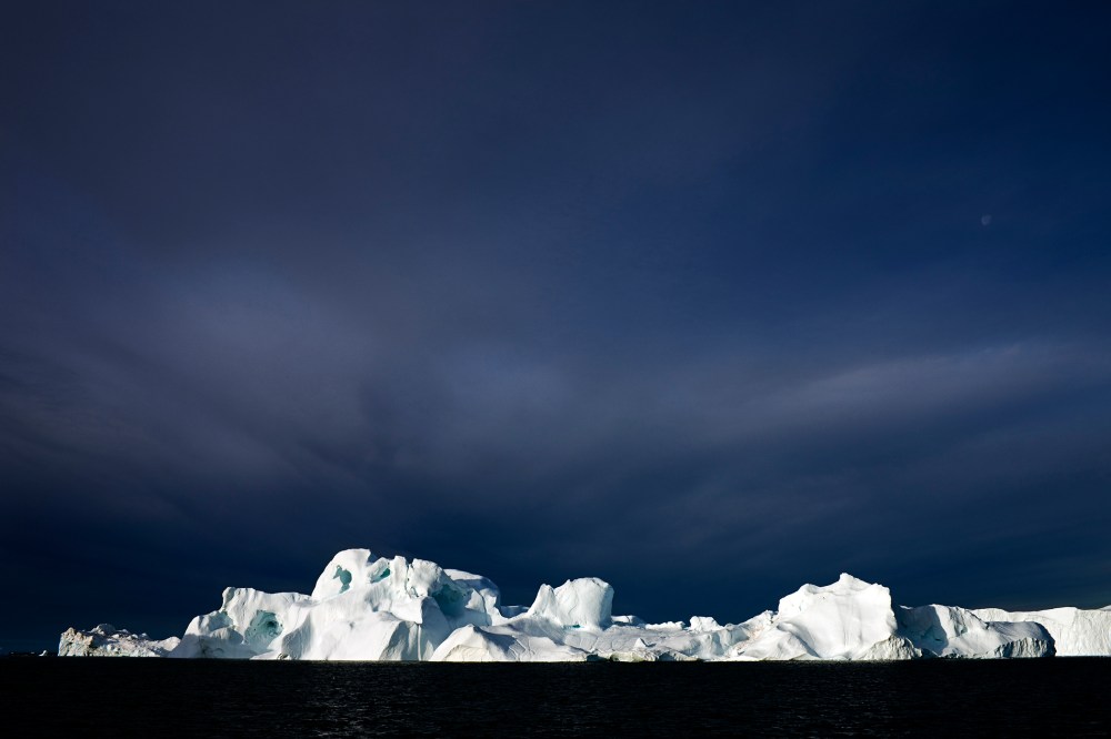
Portraits of Melting Ice


The immediate solution to the problem of melting is, well, never mind. None exist. The answer will, instead, be a slow process of healing that will only begin with an aggressive plan to curb greenhouse gasses and gradually return us to a thermal equilibrium. Sadly, the commitment to a plan like that doesn’t exist yet either — and that may be the true tragedy.
Chapter 4: Urban Explosion | By Bryan Walsh
“Moving to the city is the first step to getting filthy rich in rising Asia.” So the Pakistani author Moshin Hamid writes in his new novel How to Get Filthy Rich in Rising Asia — and billions of people apparently agree with him. The story of the past century has been the story of urbanization, of the great migration of human beings from the rural countryside to the city. It happened first in the developed West and in countries like Japan, resulting in the explosion of major cities like New York, Los Angeles and Tokyo. And in younger cities like Las Vegas, a settlement carved out of the desert and built on little more than dreams, the expansion is continuing.
But it’s in the developing world that the urbanization wave is truly epochal. Hundreds of millions of people in Asia, Africa and South America have moved from villages and farms to swollen megacities, filling slums and tenements, providing the human fuel for the engine of an amazing economic transformation. Cities like Shanghai (see video below), Lagos, Bombay and São Paulo have blown up, sprawling over neighboring territory. From space, these megacities look like tumors colonizing the tissue around them.
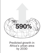
And this is only the beginning. In 2008, for the first time in history more than half the world’s population lived in urban areas; that proportion will only increase in the years to come as more and more people seek their fortune in cities. Right now from 3% to 5% of the world’s surface qualifies as urban. But according to a 2012 study published in the Proceedings of the National Academy of Sciences, urban territory will expand by more than 463,000 sq. miles (1.2 million sq. km) by 2030, eventually covering about 10% of the planet’s land. More than 75% of that increase is expected to occur in Asia, especially in countries like China, which already has more than 160 cities with at least 1 million people. The urbanization wave will be even larger in Africa, where urban area—which amounted to only 16,000 sq. miles (41,000 sq. km) in 2000 — is predicted to grow by 590%.
The urbanization wave can sound scary — especially if you visit the polluted and congested slums that ring new megacities like Lagos and Jakarta. Still, hundreds of thousands of people are leaving the countryside each day because there are real economic opportunities to be found in the city, not to mention a taste of freedom and excitement that doesn’t exist in the village. And if urban migration is handled well — with smart city planning and environmental protection — it can actually be good for the planet. Concentrating people in dense settlements allows them to use less energy than they would in spread-out rural areas. (A Manhattanite’s carbon footprint is some 30% smaller than the average American’s.) As people move to cities, they eventually have far fewer children, helping curb overpopulation.
Ultimately there’s no turning back the urbanization wave, but thanks to Timelapse, we can view a few key case studies:
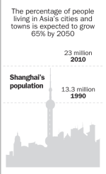
Shanghai: Shanghai isn’t a new city. The major port has long been China’s second city after the capital of Beijing, as well as its chief portal to the outside world. But the changes Shanghai has undergone over the past two decades dwarf those experienced by almost any other city in the world. Shanghai’s population has grown from 13.3 million in 1990 to over 23 million in 2010. The city has sprawled out from its historic center at the mouth of the Yangtze River, with new developments gobbling up ancient farmland and villages. The Timelapse images above show Shanghai as an urban stain expanding relentlessly in all directions.
The most astounding transformation has taken place just across the river from the heart of old Shanghai. Pudong was little more than farmland and a few river wharves in 1993, when the Chinese government turned the area into a Special Economic Zone. Freed from China’s restrictive economic laws, Pudong quickly became a mecca for Chinese capital, allowing Shanghai to soon regain its status as the country’s financial heart. Futuristic skyscrapers bloomed almost overnight, including the iconic Oriental Pearl Tower and the tallest building in China: the Shanghai World Financial Tower. Seen at night through a typically misty Shanghai sky, Pudong looks like the set of Blade Runner come to life. Shanghai, the most populous city in the most populous country in the world, is the face of the 21st century.
But that sharp growth has also strained Shanghai’s environment. Air quality in the city is often atrocious, as it is in other Chinese megacities. The rapid increase in wealth has led to a spike in car ownership, and despite the breakneck pace of new road construction, traffic in Shanghai often comes to a standstill. The worst problem is Shanghai’s water: the city’s growth has taxed freshwater supply even as pollution has poisoned it. Earlier this year thousands of dead pigs were found floating in the Huangpu River, which flows into Shanghai, and no one could explain why. Government officials have taken steps to address the problems arising from the city’s rapid growth — investing in a subway system and restricting private car ownership — but more will need to be done to keep Shanghai from choking on itself.
Dubai: In the mid-1980s, when the Timelapse images begin, Dubai was a small desert city of about 300,000 people, overshadowed by nearby Abu Dhabi, the capital of the United Arab Emirates. What growth Dubai had experienced was mostly recent; in the 1950s it was little more than a village, with pearl diving its chief industry. Today, Dubai’s population exceeds 2.1 million, and the metropolis has asserted itself as the financial center of the Middle East.
Dubai is a city that seemed to grow almost overnight, like a desert oasis made real. It has the world’s tallest skyscraper — the Burj Khalifa, seen in Mission Impossible: Ghost Protocol — as well as its largest mall, its biggest theme park and its longest indoor ski run. Writer George Saunders calls Dubai “the Disney World of the Middle East, if Disney World were the size of San Francisco and out in a desert.” He’s pretty much right. Not content with simply building in the desert, over the past couple of decades Dubai has built out into the sea. Sand dredged from the seafloor has been used to create artificial islands of recognizable shapes — including a pair of palm trees. In the lower-right corner of the Timelapse images, areas of empty sand are filled up with new buildings, as the city grows further and further away from the sea, pushing into the desert. That breakneck pace of development has slowed somewhat in recent years, as Dubai was hit hard by the global recession of 2008. But Dubai is still the place to go in the Middle East to spend money — which means artificial palm islands may only be the beginning.
Las Vegas: Before Dubai, there was another city that grew out of desert nothingness. Las Vegas has a few decades on Dubai, but it’s only over the past 30 years — captured in the Timelapse imagery above — that Sin City has hit the big time. And has it ever—the population of Clark County, Nevada, home to Las Vegas, has grown from a little under 500,000 in 1980 to about 2 million now. While most of the attention has been focused on the glitzy Las Vegas strip — home to megasize casinos like the MGM Grand and the Bellagio — the real growth has been not up but out. Throughout the 1990s and much of the 2000s, the boundaries of metro Las Vegas kept expanding, as new housing developments were thrown up to accommodate the throngs of Americans who wanted to take advantage of the region’s booming economy. From 2000 to 2010, the city’s population grew by nearly 50% — a rate that’s hard to find outside the developing world.
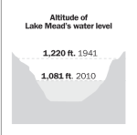
But if Las Vegas boomed along with the housing sector during the first several years of the 21st century, it went bust when the recession hit. The city was ground zero for the foreclosure crisis. As late as 2012, Las Vegas had one foreclosure filing for every 99 housing units, good for the fourth highest rate in the country. And as economically unsustainable as Las Vegas’s growth has proved to be over the past several years, it may be even more environmentally unsustainable. The city receives almost no rain, and most of its water comes from nearby Lake Mead. But as can be clearly seen in the Timelapse images, Lake Mead is drying up, the victim of a prolonged drought — potentially abetted by climate change — and the increasing demand placed on it by Las Vegas’ growing population. Lake Mead’s water level has fallen from a little over 1,200 ft. (365 m) to 1,125 ft. (343 m) now. In recent years, officials in Las Vegas have taken admirable steps to reduce water waste, but if Lake Mead keeps shrinking, Sin City will stop growing.
Credits: Executive Producer: Jonathan D. Woods / Editors: Edward Felsenthal, Steven James Snyder and Adam Sorensen / Design and Development: Alexander Ho, Daniel Bernard, Peter DiRenzo, Katie Rooney, Micah Ernst, Christine Lim and Eujin Measson / Video: Ian Orefice, Jim Fields and Evan Michals / Photo: Mikko Takkunen, Tanner Curtis, Erica Campbell, Elizabeth Herman and Richard Conway / Infographics: Heather Jones / Google: Rebecca Moore, Peter Birch, Simon Ilyushchenko, Matt Hancher, Eric Nguyen and Nate Tyler, / Carnegie Mellon University: Randy Sargent, Yen-Chia Hsu, Paul Dille and Illah Nourbakhsh / USGS-Landsat: Tom Loveland / NASA: Jim Irons / Additional Footage: Denise Zmekhol (ZD films)